Since finishing grad school almost three years ago, I have been telling myself that I want to get better at graphic design. While I make data visualizations frequently, I do not often have a reason to do design work. Aside from an elective in high school where I was introduced to Photoshop, I did not use design software in my classwork so I did not develop skills like I did in R. So, a couple of years ago I downloaded Inkscape, dabbled with it for a week, and then put learning how to use it on the to-do list in my mind that I never seem to get to. Until a few weeks ago that is, when something caught my eye that inspired me to fire up Inkscape.
For a long time, I have been a big fan of the Uni Watch website. My started a number of years ago when Paul Lukas would post his preseason uniform previews on ESPN.com, and that led me to find his website. He fairly regularly runs contests to redesign team uniforms, which I always enjoyed but never submitted to. In February though, he ran a “Redesign the Patriots” contest. The premise was that since the Patriots current uniform debuted in the 2000 season, that means it coincided with Bill Belichick’s first season as head coach and Tom Brady’s rookie season. With the Belichick/Brady Era coming to a close, it makes sense to redesign the uniforms to coincide with the next era of the franchise history. The Patriots have always been my number one team as a fan and this seemed like a perfect opportunity to learn a little about graphic design.
As a lifelong Patriots fan, and someone who enjoys the aesthetic aspects of team sports, it has never been lost on me that the Pats current look has completely coincided with the Belichick/Brady Era. My personal feelings on their current look are mixed, but it cannot be denied that the best on-field moments in franchise history have taken place with the team wearing these uniforms, and I like the idea of the current uniform set being retired at the end of the Belichick/Brady Era in order to always keep that visual association in place. That being said, I feel like any redesign for the Patriots would have to rely heavily on the history of the franchise as opposed to being a radical overhaul. With that in mind, I set out on my design process.
I started by identifying aspects of the Patriots current uniform designs that I like the best. For me, and I suspect for many Patriots fans, that starts with the Pat Patriot logo. For a few years the Pats were including this logo in a throwback uniform, however when the NFL instituted the One Shell Rule the team was no longer able to swap out helmets and shelved the throwback use on-field. It was tempting for me to make Pat Patriot the primary logo again, but I decided against doing so because I lean heavily on visual associations. For the 30+ years that Pat Patriot was the primary logo, the Patsies were one of the saddest sad-sack franchises of the NFL. When the team moved away from that logo at the start of the Drew Bledsoe Era, the Pats started a run of on field respectability that led to decades of dominance. Therefore I did not want to make Pat Patriot the primary logo, but I did want to be able to include it as part of the overall design.
The other aspect that I really like about the Patriots design is the current uniform color palette. I like the nautical blue and deeper shade of red much more than the lighter shades the franchise employed in the 20th century. I decided to use those as the basis of the new design. However, in order to work Pat Patriot back into the mix, I decided to drop the use of silver. That led to questions about the primary logo: should I modify the Flying Elvis, or retire it in favor of a new logo? My first thought was to redesign the Flying Elvis, possibly using Tedy Bruschi as a model (a la Jerry West). I decided not to do that for several reasons: 1. It could look very creepy; 2. Part of the reason I am doing this project is to improve my rudimentary graphic design skills, and I know I am not able to pull that off (yet); and 3. Keeping with the theme of aesthetic associations, this seems like a good opportunity to retire Pat Patriot. So by process of elimination, it was time to design a new logo.
While brainstorming concepts for a logo, I kept coming back to how meaningful the number six is to the Patriots franchise. The Patriots were one of the original six AFL teams, there are six New England states, and of course the franchise has won six Super Bowls. Leaning on this history, I designed a logo featuring six stars arranged in a circle, meant to evoke the design of the original Betsy Ross flag. I considered making the stars six-pointed to distinguish the logo from the Dallas Cowboys logo, however I used five-pointed stars keeping with the legend of Betsy Ross. Pairing with this new logo is a font meant to evoke the work of the Revolutionary Patriots who are the team’s namesake. Pat Patriot is included as a secondary logo, with colors updated to the current palette and some of the lines made bolder to make the logo a little more distinctive.

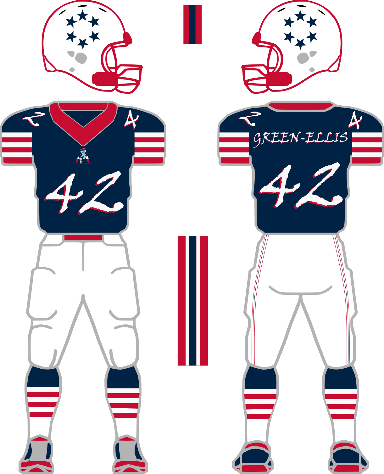
Once the logos were developed, I started in on the uniforms, beginning with the standard home set. The primary color on the jersey is nautical blue for the home uniform, unchanged from the Patriots current uniform. Aside from that, though, the other elements of the look are an update. The helmets are white, featuring the new six-star logo, red-blue-red stripes across the top, and a red facemask. Keeping with the theme of six, the sleeves on the jerseys and the socks both feature six stripes. For the home uniform, white pants replace the silver pants in the current set. There is also an alternate red pants option that can be paired with either the home or the road uniforms. The numbers and font on the jerseys are the same font as the logo, and have a subtle drop shadow as a nod to the 1990s Patriots uniforms. The updated Pat Patriot logo is used under the collar instead of a wordmark.
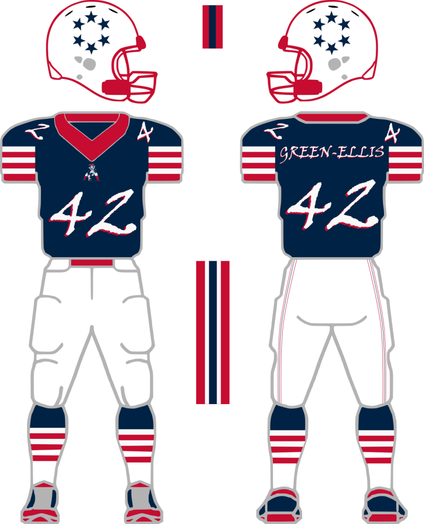
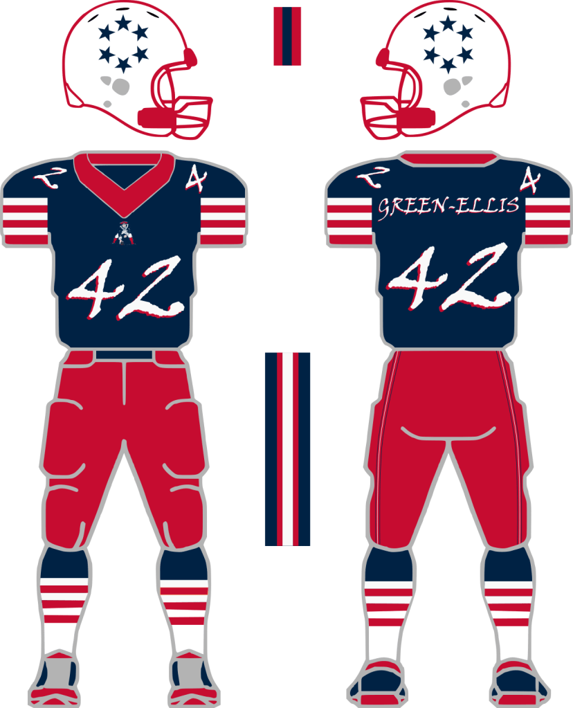
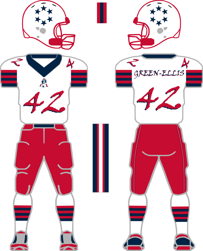
The standard road uniform features the same colors as the Patriots current set, a white jersey with nautical blue pants. The jersey features the same font and drop shadow as the home jersey, as well as six sleeve stripes. The pants feature an updated stripe pattern from the current Patriots road pants. Socks for the road uniforms also feature six stripes, but are slightly different from the home socks. The helmet is the same as for the primary home uniform. Like the home uniform, the alternate red pants can also be paired with the road unis.

The alternate uniform is an updated take on the classic 1980s Patriots uniform. The helmet features the updated Pat Patriot logo with the red-blue-red stripes and reg facemask. The TV numbers are moved from the shoulders to the sleeves, and the shoulders feature the classic stripes. The colors, though, have been updated to the current color palette. Another deviation from the classic uniforms is the employment of a block font for the numbers and the names, again featuring a subtle drop shadow as a tie to the Bledsoe Era unis.

In addition to the alternate, I also created a Color Rush uniform design. Across the NFL, my favorite Color Rush designs are the ones that use white as the base (New Orleans and Cincinnati) so I decided to use white for my Patriots Color Rush design. The jersey has the six-starred logo on the front encircling the player number. Since the jersey heavily features the six-starred logo, I use the Pat Patriot logo on the helmet. The pants have six stars going down each leg in lieu of pants striping. The socks have a different stripe pattern from the other uniforms.

For the designing process, I started with a blank NFL uniform template that I downloaded from Pinterest. I loaded the template in Inkscape, and ungrouped the vectors within the image. From there, I edited the parts of the template to make the base of my uniform designs. From there, I drew the details. Admittedly, this is far from a Nike press release design, but I’m happy I was able to create my design in a presentable manner on a first attempt! And my submission was included in the contest results, which was nice to see. All in all, this was a project that I enjoyed working on, so I will have to find more projects to do in Inkscape in the future.
