Analyzing my morning train rides
Introduction
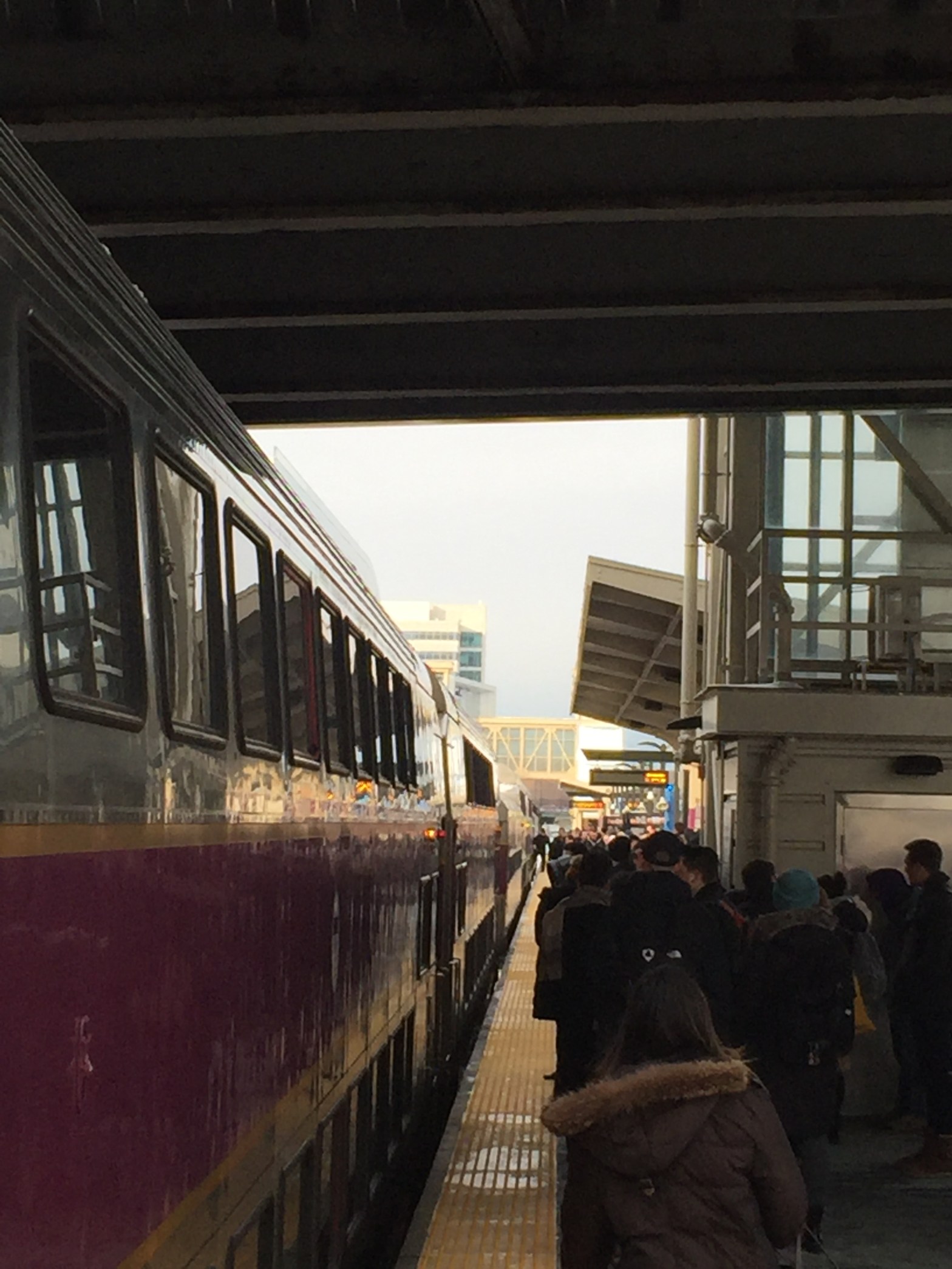
Over the course of 2019, I was convinced that my commute was getting worse. For the prior year, I had been taking the MBTA Commuter Rail to work from my new apartment in Allston. In the morning, I would board a train at Boston Landing, and depart two stops later at Back Bay. Depending on my morning, I would take one of three trains: train 586, scheduled to depart Boston Landing at 7:55 and arrive at Back Bay at 8:05; train 588, scheduled to depart at 8:30 and arrive at 8:40; or train 510, scheduled to depart at 8:40 and arrive at 8:50. Through the summer and fall, it seemed that the trains were departing later and later, and more and more people were on the trains.
It was also not unusual that there was not enough room on the train for the passengers at Boston Landing, and I would be stranded to wait for another train. On numerous occasions, I reached out to the MBTA to ask why, when this was happening, did they not deploy bigger train sets for these specific trains? Conductors were often apologizing for having small train sets on a particular train, but there never seemed to be any rhyme or reason as to how the trains were deployed. I never got a response.
Being the data enthusiast and public policy nerd that I am, I decided to do a little bit of research myself and see what I could find out about my commute. Specifically, I wanted to answer questions regarding my perception of the commute; were my morning trains getting more crowded, and were they departing Boston Landing at later times? I went to the MBTA Performance Dashboard to see what data they had on Commuter Rail performance to try and confirm my suspicion that my commute was getting more crowded and more delayed. I was a little disappointed with what I found. For ridership, the MBTA does not publish data by Commuter Rail line; it only publishes average weekday ridership across the system by month. Hardly a useful metric for the question I was trying to answer. Performance data was a little bit closer. The MBTA publishes the percentage of trains that were on-time each day, broken out by peak hour and off-peak trains. This still was not exactly what I was looking for though, for two reasons: one is that I was specifically looking for my morning commute, and the MBTA data does not differentiate inbound and outbound peak hour train performance in the data, and; two is that not every peak hour train stops at Boston Landing, so it was possible that express trains that do not service my stop could be inflating the performance of the trains available for me to take. Unsatisfied by my findings, and with these questions about my commute continuing to itch at me, I did what any normal person would do – I designed a data collection to do as part of my daily commute that would help me answer these questions.
The Data
The dataset I put together includes observations from 49 separate morning trains, spanning from mid-November 2019 until Governor Charlie Baker declared a State of Emergency for the COVID-19 outbreak in mid-March 2020. There are 19 observations of train 586 (7:55 AM departure), 12 observations of train 588 (8:30 AM departure), and 18 observations of train 510 (8:40 AM departure). The observations include the actual departure time, the number of coaches in the train set, the number of bi-level coaches in the train set, whether seats were available when the train got to Boston Landing, whether passengers were standing in the aisles, whether all passengers who wanted to board at Boston Landing were able to get on the train, and whether fares were collected. To ensure consistency in the observations, I took several measures when boarding the train in the morning. First, I boarded a middle coach whenever possible so the observations are as consistent as possible day to day. Second, I made sure to be one of the last to board the train so that if passengers were denied boarding at Boston Landing due to the train being full, I could observe that taking place. Third, since some people prefer to stand on the train rather than sit, I only marked “yes” for people standing in the aisles if they were doing so against their will, i.e. number of standees was greater than the number of available seats (Figures 1 and 2). Finally, I only marked if fares were collected if the conductor staffing my coach collected fares.
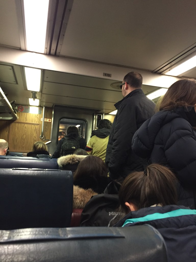
Figure 1 – The available seats outnumbered standing, so the “Standing in Aisles” = No 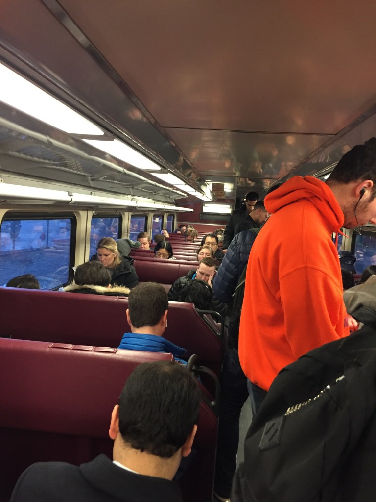
Figure 2 – The number of standing passengers outnumbered available seats, so “Standing in Aisles” = Yes
Since it is impossible for me to count the number of passengers on the train, I developed a way to estimate the number of passengers through the recorded observations. By counting the number of coaches on the train, I can calculate how many seats there are available. From there, by observing whether seats were available and whether people were standing in the aisles, I can estimate how many passengers were on the train. According to Wikipedia, the MBTA Commuter Rail has 6 models of single level coaches containing between 86 and 127 seats, and the seven models of bi-level coaches containing between 179 and 185 seats. For the purposes of estimating, I used the median number of seats for the various series of coaches, 118 seats for single level coaches, and 179 seats for bi-level coaches. To estimate the number of passengers on the train, I used the following benchmarks: when there are seats available and nobody standing in the aisle, the estimated passenger count is equal to 90% of capacity (Figure 3); when passengers are standing in the aisle, the estimated passenger count is equal to 120% of capacity (Figure 4); and when the train was full and left passengers behind, the estimated passenger count is equal to 150% of capacity (Figure 5).
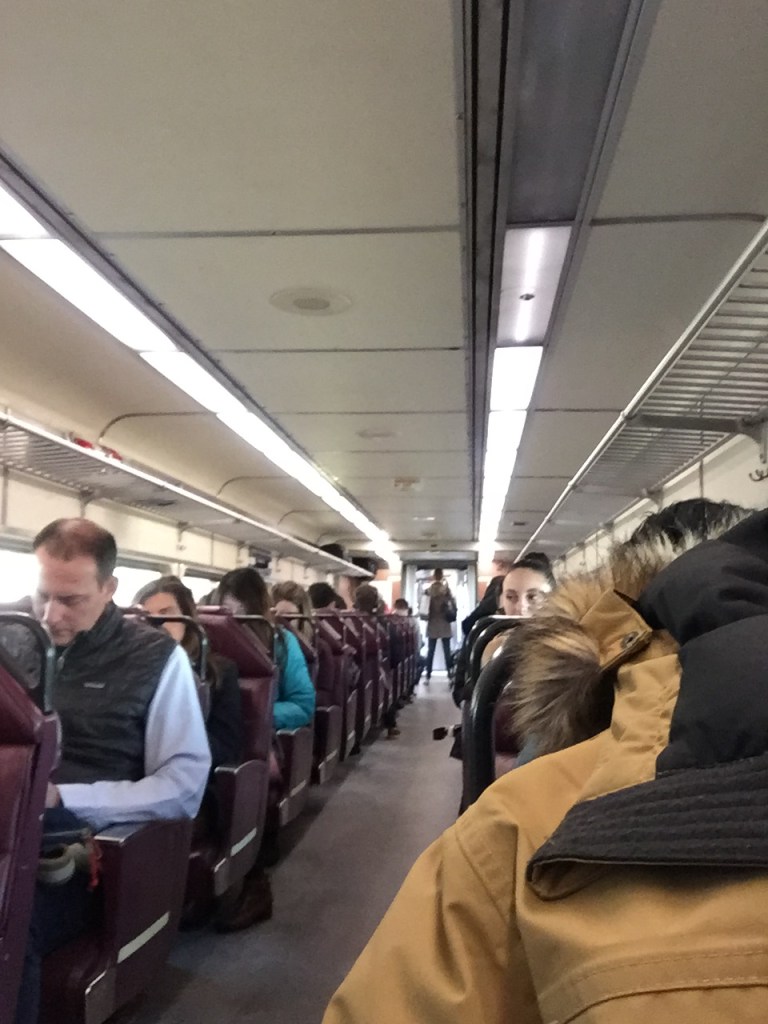
Figure 3 – seats available = 90% capacity estimate 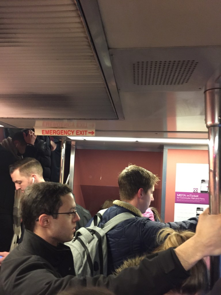
Figure 4 – passengers in aisles = 120% capacity estimate 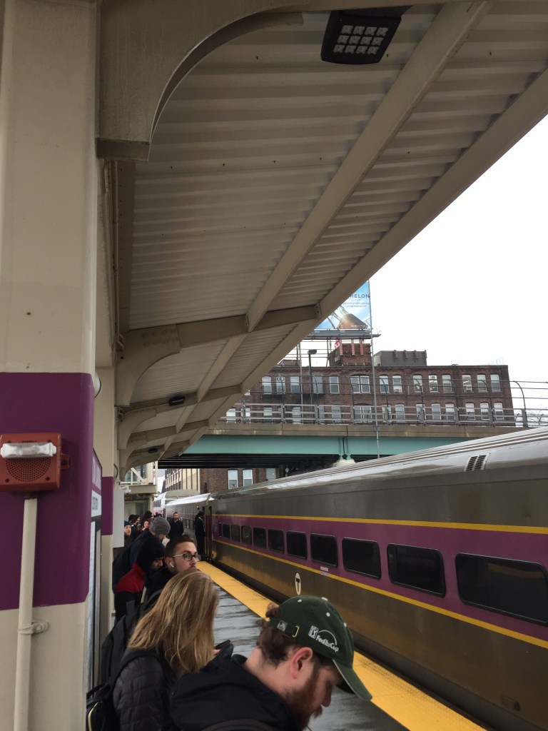
Figure 5 – passengers denied boarding = 150% capacity estimate
A few notes about limitations in the data. First, I limited the data to the three trains that I normally take, trains 586, 588, and 510. If I took a different train for some reason, or took the bus or subway to work instead of the Commuter Rail, I did not record data. Second, I did not record data for weeks with a mid-week holiday (Christmas and New Year) because I figured that many people would take a full week off from work. However I did record data on weeks with a holiday adjacent to a weekend (Thanksgiving, Martin Luther King Jr. Day, and Presidents Day) because I figured people would be more likely to take a long weekend than a full week off. Last, the data observations are dependent on which train I decided to take on a given day, so I cannot compare train 586 to 510 on the same day. I realize that there is inherent bias in that, but ultimately I want to answer questions about my commute, not the experience of an average commuter. So while the data set can answer my questions, it is inherently limited to my personal experience on the commuter rail.
Results
Were the trains getting later?
When it came to researching my two questions, this was the easier one to answer. Simply comparing the scheduled departure to the actual departure allowed me to quickly measure the deviation of the trains from the schedule. Looking across the timespan of the dataset, the actual departure times got closer to the scheduled departure times as the winter progressed. On a month by month basis, the average delay from the scheduled departure time dropped from 13.2 minutes in December 2019 to 4.3 minutes in March 2020 (see Table 1).
| Month | Average Difference from Schedule | Percent of Trains Officially Delayed |
|---|---|---|
| November 2019 | 5.5 min | 100% |
| December 2019 | 13.2 min | 67% |
| January 2020 | 3.1 min | 21% |
| February 2020 | 6.7 min | 40% |
| March 2020 | 4.3 min | 33% |
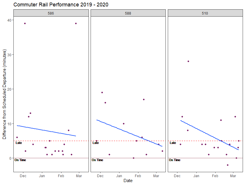
On a day by day basis, this trend is also seen. Figure 6 is a scatterplot of all the trains in the dataset, with the y-axis showing the length of the schedule deviation. The MBTA considers a train to be “delayed” when it is more than 5 minutes behind schedule. In the chart, this is denoted by the dashed red line. As the winter progressed, more trains fell inside that 5 minute “on-time” window and there are fewer points above the red line. The fitted linear regression line also shows that the overall trend of delays decreasing over the time period. Figure 7 shows that these trends hold across all three morning trains.

Were the trains getting more crowded?
As discussed earlier, measuring the number of passengers was more difficult. But by estimating the ridership, I was able to compare how it was changing over time. From November through January, the average number of passengers for the month went down. In February, the average went up, before plummeting in March (see Table 2).
| Month | Average Estimated Passenger Count | Percent of Trains Over Capacity |
|---|---|---|
| November 2019 | 1106 | 100% |
| December 2019 | 997 | 58% |
| January 2020 | 964 | 57% |
| February 2020 | 983 | 40% |
| March 2020 | 785 | 17% |
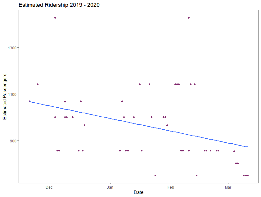
Looking at the estimated ridership for the individual trains, there is an overall downward trend in estimated passengers per train over the time period. Figure 8 is a scatterplot of the trains in the dataset, fitted with a linear regression line that shows the downward trend. This trend is seen across all three trains when they are looked at individually as well (Figure 9).

I wondered if the downward trend in ridership was driven by people working from home due to the Coronavirus pandemic. To control for this, I examined the data again excluding the observations for trains in March. When excluding the March data, there is still a downward trend, however it is not as pronounced. See Figure 10.

Was my commute getting worse?
For months, I was grumbling about my commute in the morning and getting frustrated because I was convinced it was getting worse. Eventually, I decided to take a deeper look at my commute to see if my frustration was founded. I attempted to utilize data made publicly available by the MBTA, but the data was not granular enough to answer my questions. Taking my quest further, I designed a data collection and recorded my observations on my morning trains for over three months. Based on that data, I have been able to conclude that my commute was not getting worse and in fact, it was getting better. The trains that I take in the morning were running closer to schedule as the winter progressed, and also were becoming less crowded. The data did not exactly paint a rosy picture of my commute – in December 2019, my morning trains were an average of 13 minutes late and more than half the trains I rode were filled beyond the seating capacity. However, with the knowledge that on the whole my morning commutes are improving, I will likely be more relaxed with my commute when I return to the office on a daily basis.
Final Thoughts
This project was very fun for me to undertake, to create an analytic dataset based on a daily part of my life. The results surprised me a little bit – I did not expect the data to show such clear improvement in the commute. I wish that I had data going back to the summer of 2019 to see if there is a longer trend before the Coronavirus situation changed the public’s daily habits. One of the things that I am most excited about going back to the office day to day is to be able to track my commute again and do a “before and after” analysis of the stay at home advisory. Finally, there are two things that I wish I had done differently in tracking my commute. The first is that I wish I collected data every day I took the train and excluded holiday week data after the fact, instead of deciding that at the beginning I would not collect data those weeks. I feel like the decision would be less arbitrary to exclude the data than to not collect it at all. The second is that I wish I recorded the number of conductors staffing each train. Most days the train would have three conductors, however there were some days when there were four and the trains seemed a little more efficient. That is definitely a data point I will add in the future. Overall, this was an enjoyable exercise for me, and one that I expect to return to in the future. I also look forward to finding other analytic projects I can do with the dataset I made, so stay tuned for more!
