Currently, the Springfield Thunderbirds of the AHL are having a contest to design the jerseys the team will wear for their next Ice-O-Topes game. As soon as I saw this promotion, I knew that it would be the next project I dove in to. This is a rare, unique combination of two of my favorite things – the aesthetics of sports and The Simpsons. It has been a while since I posted here. I did not plan on going this long between postings, and I have a couple of projects I started and plan on finishing and posting at some point. I also do not plan on this site being just uniform design contest entries. I started looking for projects that piqued my interest and helped me to either learn new skills or flex my analytical muscles early in the COVID-era to be productive with my new time at home, and this site was meant to be a place for me to share what I was working on. Alas, parenthood has taken priority over side projects for my personal website, and this is the first thing I have actually completed in a while.
Interestingly, the first Springfield Ice-O-Topes game was the last “social” thing I did for a long time before lockdowns were imposed. In February 2020, the Thunderbirds rebranded for one night as the Ice-O-Topes for a Simpsons themed night, complete with merchandise, clips from the show on the video boards, and of course, special uniforms. I drove out to Springfield for the game with two of my buddies, and spent much of the 90-minute drive talking about the crazy virus situation that was going on in China. We then proceeded to spend the rest of the night in packed crowds, not imagining that it would be months before we could think of doing anything like that again. Beyond the fun aspects of this contest, the return of the Thunderbirds and an Ice-O-Topes promo night for me is a bit of an unexpected milestone in the reopening of society.
The contest itself is pretty straightforward. The team provided a template that designs need to be submitted on. The only logos that can be used are the two included in the template, and the color palette for the team was also given. I imported the template into Inkscape, and created the designs in that program. Also, contestants can only submit one design – multiple submissions are not allowed. Unfortunately for me, I have several designs that I think are pretty clever.
Designs
The Mr. Boy Concept
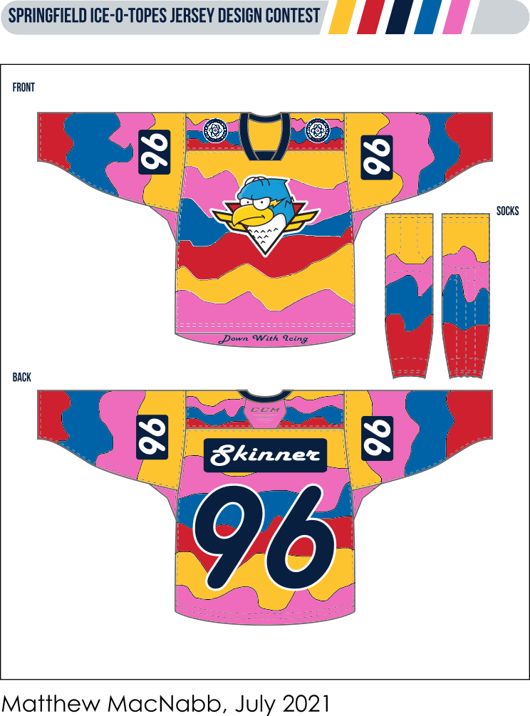
My first thought when I heard about this contest was to base the jersey on a uniform that exists in The Simpsons. In my opinion, the best uniforms in the series exist in the season 7 episode “Team Homer.” Not only does Homer’s bowling team wear uniforms, but Principal Skinner also imposes school uniforms on the students at Springfield Elementary (available at the Mr. Boy and Mr. Boy for Girls stores). These drab uniforms become colorful when the students get caught in the rain, and the grey clothes turn multi-colored. My design is an ode to all the uniforms in this episode. The base of the jersey is multi-colored, using the colors from the included color palette. To mimic the running colors of the school uniforms, I hand drew the lines for each section. I intentionally did not pay much attention to the size and shapes of the sections as an homage to the original Pin Pals uniform that Homer and his team wore in the bowling league. For the logo on the chest, I used the secondary logo as opposed to the primary crest because I thought the sharp lines on the secondary logo contrasted well with the running colors aesthetic of the base. The primary crest is included on the shoulders. The font of the nameplate and numbers is meant to evoke the Pin Pals bowling shirt that Mr. Burns made for the bowling team at the end of the episode. Finally, at the bottom of the jersey I included script that says “Down with Icing.” In the episode, it was a t-shirt Bart wore that said “Down with Homework” that led to Principal Skinner imposing school uniforms.
The Country Club Concept
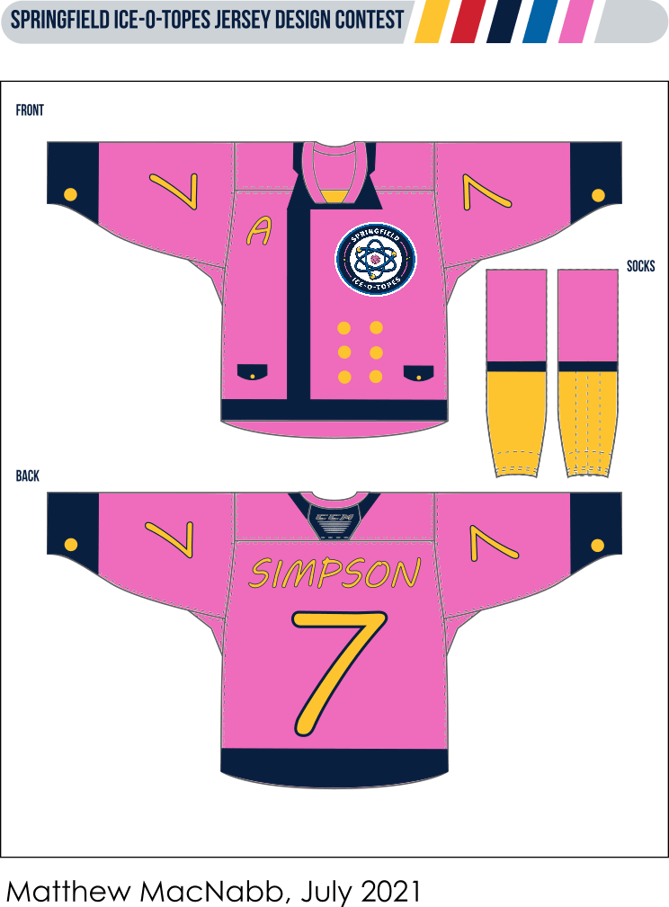
My close second thought for a jersey concept was to base the design on a look created by one of The Simpsons characters. Initially I wanted to use the Floreda costume that Homer made for Lisa, but there was not much to work with for colors. I moved on to the Chanel suit that Marge constantly modified in another season 7 episode “Scenes from the Class Struggle in Springfield.” After finding an expensive suit marked down at the Ogdenville outlet mall, Marge is invited to the Springfield Country Club. In order to try and keep up with the upper crust members, Marge keeps altering the suit to make it look like a new outfit every time she goes. My design attempts to be a fairly faithful replica of the suit, or at least as much as a hockey jersey can be. One slight change is that I used the dark blue on the color palette instead of black for the trim. The Ice-O-Topes crest is off-center and scaled down to accommodate the buttons. With the logo on the left side, I moved the captain letters to the right shoulder instead of the standard left.
The Sideshow Bob Concept
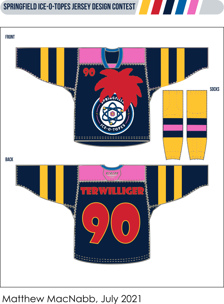
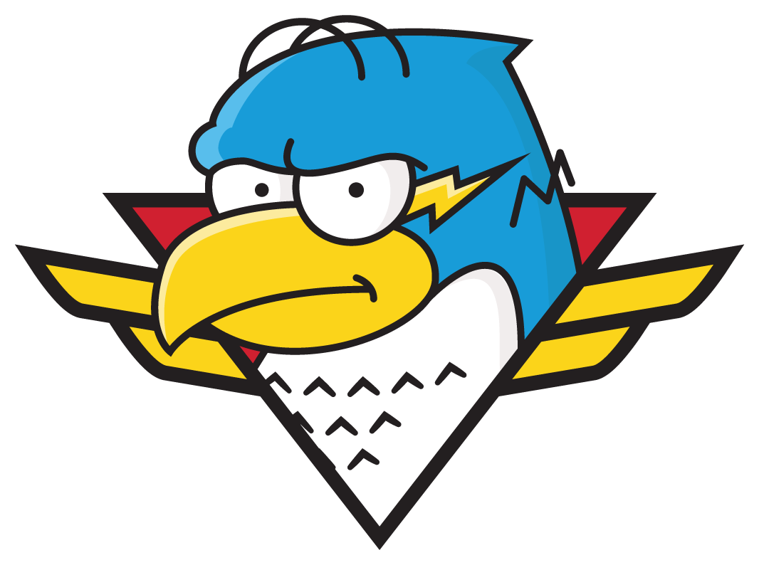
Since the rules of the contest require designs to only use the logos provided by the team, I tried to think of ways to include visuals that are iconic to The Simpsons and would evoke connections for the average viewer. One of the most iconic and instantly recognizable characters in the whole series in my opinion is Sideshow Bob and his distinctive hairstyle. I thought that adding his hairstyle on top of an Ice-O-Topes logo would be a fun and different way to be on theme. And since red is included in the color palette, it also works in the Thunderbirds aesthetic. I chose to put the Sideshow Bob hair on top of the primary crest as opposed to the secondary logo, because the bird in the secondary logo already has Homer’s hair. Originally, I designed this jersey with a yellow base and a red shoulder yoke, but it had too much of a Ronald McDonald vibe. To mix things up, I put the TV numbers on the front of the jersey instead of on the sleeve.
The Monorail Concept
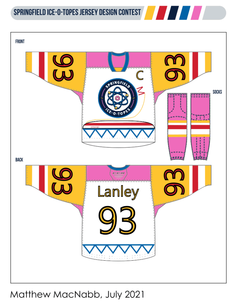
The other idea I had to include visuals iconic to The Simpsons was to base a design on something from Springfield itself as opposed to a character. Thinking of iconic and recognizable elements from Springfield, I landed on the Monorail. “Marge vs. the Monorail” is a very famous episode that is familiar to people who know The Simpsons more casually. For my design, I decided to start with using the Monorail track as striping across the bottom of the jersey, with the train on the front side. While the Monorail track in the show is supported by columns as opposed to a truss, I felt that the triangles provided an interesting and eye-catching design, and a nice contrast to the rounded Monorail train and the crest. The font on the nameplate and numbers is inspired by the font on the Monorail train in the show. On the sleeves, the stripes are designed to match the stripe on the Monorail train. I also made the numbers on the sleeves oversized, similar to the NHL Stadium Series jerseys in 2016. The socks stripes are stylized similar to the sleeves. Finally, I put the letter M on the side of the crest on the jersey to anchor the train, as Homer anchored the train onto the giant Lard Lad donut.
Final Submission
For my final submission, I am leaning towards sending in the Monorail Concept. I really like all four designs, but I think the Monorail Concept is probably the strongest. I think a hockey team probably would not want to base a jersey on a Chanel suit, even a cartoon one. While the Sideshow Bob hair is distinctive, the colors of the jersey on a whole are similar to the standard Springfield Thunderbirds jerseys and the team might be looking for something different for marketing and merchandising. I really like the Mr. Boy Concept, but I’m not sure that the references would be appreciated by the average fan. I also really like the Monorail Concept, and I think that of the four, it is the one that most distinctively evokes The Simpsons. There are still 10 days until submissions are due, however, so I may change my mind. Feel free to reach out with any feedback!
