Spring Street Station

It is amazing how you can pass by something without ever noticing it, even in your own neighborhood. A few years ago, while I was training for a marathon, one of my favorite parts about the long runs was noticing new sites around the city that I previously had paid no mind to. For example, I had never noticed the 1767 Milestones located around Boston until I spotted the one on Huntington Ave on a run. After that, I started seeing them around the area on many of my runs. It was amazing to me how these not-so-hidden relics of the past were able to blend in to modern city life.

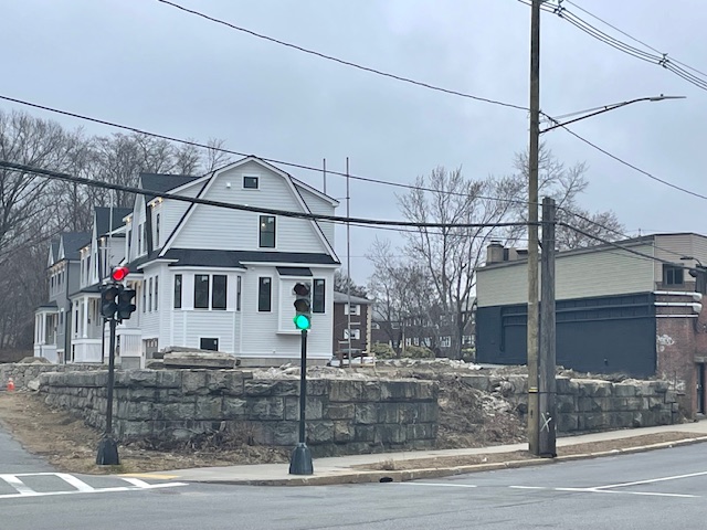
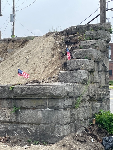
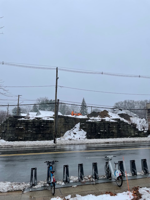
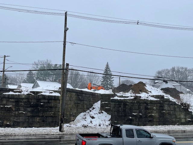
More recently, I had an even larger historic relic emerge in my neighborhood that had been hidden in plain sight. On Spring Street in West Roxbury, about ¾ of a mile from my house, there was a large stone wall that was overgrown with vegetation. I had been driving past this spot many times over the past two decades, even before I lived in the neighborhood. My brother went to Catholic Memorial right around the corner, so I was in the neighborhood daily during my high school years, and even after would often pass through there going in and out of the city via Centre St. I had never given much though to it, until after I moved to the neighborhood and I had the idea that it might have been more than just a wall; it actually looked like it may have been the abutment a train bridge. This prompted some online sleuthing, and discovering that it was along the right of way of the former Commuter Rail Dedham Branch, which was shut down in the 1960s, not long after the MBTA took over operations of the rail network. There was also a day when I pulled into the Star Market parking lot across the street with a GPS app active on my phone (not something that happens often) and the GPS said “driving on abandoned railroad bed” which was more evidence to me that there had at one point been a railroad bridge there.

The overgrowth on the abutment in 2023, sourced from Google Maps street view

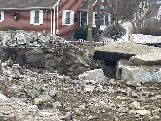
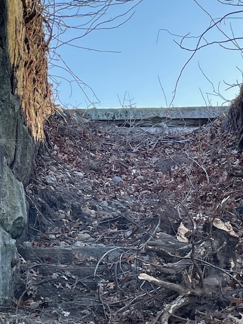
Last winter, my interest in the site grew when the vegetation along the abutment got cleared. Walking by in February 2024 after the overgrowth was removed, I noticed that in the middle of the abutment, there was a staircase! It had not been visible before because there were literally trees growing in the middle of it. I took some pictures of the site to do further online sleuthing when I got home. This led to my discovery that it was not just the remains of a bridge, but actually the remnants of an old station! Spring Street Station appears to have opened in the 1880s and closed in the 1930s. About a month after my discovery, Universal Hub had an article that confirmed what I had found and contained some additional details.

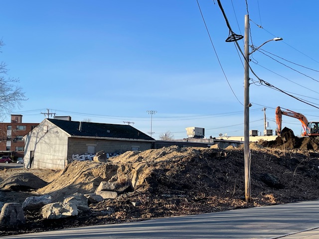
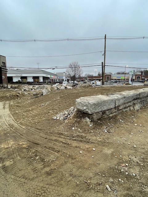
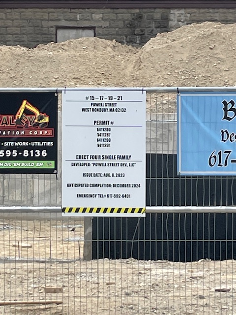
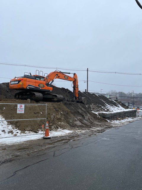
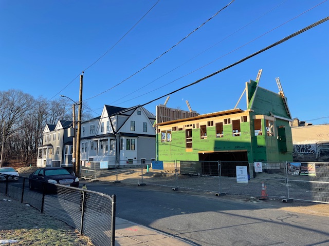
The vegetation around the abutment was cleared to make room for four new single-family houses. Over the past year, I have been watching as different parts of the site were cleared, and houses began to rise. Last week, a commercial building abutting the site was demolished to clear more space. Now, three of the four houses are at least to the point of being framed, and construction is at the point where the giant stones from the ruins of the station are being removed and broken into smaller pieces to be hauled away from the site. It is the last impediment to the fourth house being built on the site.

As I have watched this site transform from the remnants of urban transit infrastructure to single-family houses that are the biggest on the block, it has been hard not to find the project ironic given the controversy in the region over the MBTA Communities Act. The law requires municipalities that are served by the MBTA to have zoning for multifamily housing in order to help ease the region’s housing supply shortage. There has been much chaos surrounding the implementation, though, with some towns refusing to comply and suing the state over the law’s requirements, the Supreme Judicial Court upholding the law but saying the regulations surrounding implementation were unenforceable, and the Auditor determining that the requirement is an unfunded mandate. Obviously, I’m not suggesting that the station be reopened instead, but it would make more sense as a multi-unit structures. Being only a short walk from the current Commuter Rail station, directly next to a bus stop, and across the street from a grocery store, it is an ideal location for car-free living. Instead, the location is getting single-family houses with garages that are bigger than all the other houses on the block.

Seeing this project unfold over the last year-plus also makes me think about how quickly things change. This station was operational when my grandparents were kids, and in the course of their lifetime, it became lost and forgotten. I wonder what I take for granted in my neighborhood might be discovered by my grandchildren someday.

Ice-O-Topes Design Contest

Currently, the Springfield Thunderbirds of the AHL are having a contest to design the jerseys the team will wear for their next Ice-O-Topes game. As soon as I saw this promotion, I knew that it would be the next project I dove in to. This is a rare, unique combination of two of my favorite things – the aesthetics of sports and The Simpsons. It has been a while since I posted here. I did not plan on going this long between postings, and I have a couple of projects I started and plan on finishing and posting at some point. I also do not plan on this site being just uniform design contest entries. I started looking for projects that piqued my interest and helped me to either learn new skills or flex my analytical muscles early in the COVID-era to be productive with my new time at home, and this site was meant to be a place for me to share what I was working on. Alas, parenthood has taken priority over side projects for my personal website, and this is the first thing I have actually completed in a while.

Interestingly, the first Springfield Ice-O-Topes game was the last “social” thing I did for a long time before lockdowns were imposed. In February 2020, the Thunderbirds rebranded for one night as the Ice-O-Topes for a Simpsons themed night, complete with merchandise, clips from the show on the video boards, and of course, special uniforms. I drove out to Springfield for the game with two of my buddies, and spent much of the 90-minute drive talking about the crazy virus situation that was going on in China. We then proceeded to spend the rest of the night in packed crowds, not imagining that it would be months before we could think of doing anything like that again. Beyond the fun aspects of this contest, the return of the Thunderbirds and an Ice-O-Topes promo night for me is a bit of an unexpected milestone in the reopening of society.

The contest itself is pretty straightforward. The team provided a template that designs need to be submitted on. The only logos that can be used are the two included in the template, and the color palette for the team was also given. I imported the template into Inkscape, and created the designs in that program. Also, contestants can only submit one design – multiple submissions are not allowed. Unfortunately for me, I have several designs that I think are pretty clever.

Designs

The Mr. Boy Concept

My first thought when I heard about this contest was to base the jersey on a uniform that exists in The Simpsons. In my opinion, the best uniforms in the series exist in the season 7 episode “Team Homer.” Not only does Homer’s bowling team wear uniforms, but Principal Skinner also imposes school uniforms on the students at Springfield Elementary (available at the Mr. Boy and Mr. Boy for Girls stores). These drab uniforms become colorful when the students get caught in the rain, and the grey clothes turn multi-colored. My design is an ode to all the uniforms in this episode. The base of the jersey is multi-colored, using the colors from the included color palette. To mimic the running colors of the school uniforms, I hand drew the lines for each section. I intentionally did not pay much attention to the size and shapes of the sections as an homage to the original Pin Pals uniform that Homer and his team wore in the bowling league. For the logo on the chest, I used the secondary logo as opposed to the primary crest because I thought the sharp lines on the secondary logo contrasted well with the running colors aesthetic of the base. The primary crest is included on the shoulders. The font of the nameplate and numbers is meant to evoke the Pin Pals bowling shirt that Mr. Burns made for the bowling team at the end of the episode. Finally, at the bottom of the jersey I included script that says “Down with Icing.” In the episode, it was a t-shirt Bart wore that said “Down with Homework” that led to Principal Skinner imposing school uniforms.

The Country Club Concept

My close second thought for a jersey concept was to base the design on a look created by one of The Simpsons characters. Initially I wanted to use the Floreda costume that Homer made for Lisa, but there was not much to work with for colors. I moved on to the Chanel suit that Marge constantly modified in another season 7 episode “Scenes from the Class Struggle in Springfield.” After finding an expensive suit marked down at the Ogdenville outlet mall, Marge is invited to the Springfield Country Club. In order to try and keep up with the upper crust members, Marge keeps altering the suit to make it look like a new outfit every time she goes. My design attempts to be a fairly faithful replica of the suit, or at least as much as a hockey jersey can be. One slight change is that I used the dark blue on the color palette instead of black for the trim. The Ice-O-Topes crest is off-center and scaled down to accommodate the buttons. With the logo on the left side, I moved the captain letters to the right shoulder instead of the standard left.

The Sideshow Bob Concept

Since the rules of the contest require designs to only use the logos provided by the team, I tried to think of ways to include visuals that are iconic to The Simpsons and would evoke connections for the average viewer. One of the most iconic and instantly recognizable characters in the whole series in my opinion is Sideshow Bob and his distinctive hairstyle. I thought that adding his hairstyle on top of an Ice-O-Topes logo would be a fun and different way to be on theme. And since red is included in the color palette, it also works in the Thunderbirds aesthetic. I chose to put the Sideshow Bob hair on top of the primary crest as opposed to the secondary logo, because the bird in the secondary logo already has Homer’s hair. Originally, I designed this jersey with a yellow base and a red shoulder yoke, but it had too much of a Ronald McDonald vibe. To mix things up, I put the TV numbers on the front of the jersey instead of on the sleeve.

The Monorail Concept

The other idea I had to include visuals iconic to The Simpsons was to base a design on something from Springfield itself as opposed to a character. Thinking of iconic and recognizable elements from Springfield, I landed on the Monorail. “Marge vs. the Monorail” is a very famous episode that is familiar to people who know The Simpsons more casually. For my design, I decided to start with using the Monorail track as striping across the bottom of the jersey, with the train on the front side. While the Monorail track in the show is supported by columns as opposed to a truss, I felt that the triangles provided an interesting and eye-catching design, and a nice contrast to the rounded Monorail train and the crest. The font on the nameplate and numbers is inspired by the font on the Monorail train in the show. On the sleeves, the stripes are designed to match the stripe on the Monorail train. I also made the numbers on the sleeves oversized, similar to the NHL Stadium Series jerseys in 2016. The socks stripes are stylized similar to the sleeves. Finally, I put the letter M on the side of the crest on the jersey to anchor the train, as Homer anchored the train onto the giant Lard Lad donut.

Final Submission

For my final submission, I am leaning towards sending in the Monorail Concept. I really like all four designs, but I think the Monorail Concept is probably the strongest. I think a hockey team probably would not want to base a jersey on a Chanel suit, even a cartoon one. While the Sideshow Bob hair is distinctive, the colors of the jersey on a whole are similar to the standard Springfield Thunderbirds jerseys and the team might be looking for something different for marketing and merchandising. I really like the Mr. Boy Concept, but I’m not sure that the references would be appreciated by the average fan. I also really like the Monorail Concept, and I think that of the four, it is the one that most distinctively evokes The Simpsons. There are still 10 days until submissions are due, however, so I may change my mind. Feel free to reach out with any feedback!

Was My Commute Getting Worse?

Analyzing my morning train rides

Introduction

Over the course of 2019, I was convinced that my commute was getting worse. For the prior year, I had been taking the MBTA Commuter Rail to work from my new apartment in Allston. In the morning, I would board a train at Boston Landing, and depart two stops later at Back Bay. Depending on my morning, I would take one of three trains: train 586, scheduled to depart Boston Landing at 7:55 and arrive at Back Bay at 8:05; train 588, scheduled to depart at 8:30 and arrive at 8:40; or train 510, scheduled to depart at 8:40 and arrive at 8:50. Through the summer and fall, it seemed that the trains were departing later and later, and more and more people were on the trains.

Continue reading “Was My Commute Getting Worse?”

Redesigning the Patriots and Playing Around with Inkscape

Since finishing grad school almost three years ago, I have been telling myself that I want to get better at graphic design. While I make data visualizations frequently, I do not often have a reason to do design work. Aside from an elective in high school where I was introduced to Photoshop, I did not use design software in my classwork so I did not develop skills like I did in R. So, a couple of years ago I downloaded Inkscape, dabbled with it for a week, and then put learning how to use it on the to-do list in my mind that I never seem to get to. Until a few weeks ago that is, when something caught my eye that inspired me to fire up Inkscape.

Continue reading “Redesigning the Patriots and Playing Around with Inkscape”